Microsoft Excel is one of the most popular and widely used spreadsheet applications in the world, known for its ability to process and analyze data with ease. One of the features that make Excel stand out from other spreadsheet applications is the Quick Analysis tool.
In this article, we will take a closer look at what the Quick Analysis tool is and how to use it effectively.
What is Quick Analysis Tool in Excel?
The Quick Analysis tool is a feature in Excel that allows users to quickly analyze and visualize data. The tool is available in Excel 2013, Excel 2016, and newer versions of Excel. It can be accessed through the ribbon menu in Excel by selecting a range of cells and clicking on the Quick Analysis button that appears in the lower right-hand corner of the selected data.
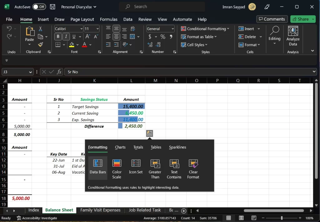
The Quick Analysis tool provides a range of options for users to analyze their data, including
- Formatting data and cells
- Creating meaningful charts
- Performing quick mathematical sum, average, % like operations
- Create pivot tables
- Add conditional formatting
- Sort, filter, and group data
It makes data analysis in Excel faster and more efficient and can help users identify trends and patterns in their data more quickly.
Overall, Excel Quick Analysis is a powerful tool that can help you save time and create professional-looking reports with ease.
How to Use Quick Analysis Tool in Excel?
Using the Quick Analysis tool in Excel is easy and straightforward. Here are the steps to follow:
Step 1: Select the Data Range
The first step is to select the range of cells that you want to analyze. This can be done by clicking and dragging over the cells you want to include in your analysis. Alternatively, you can click on a single cell and then use the Shift key to select a range of cells.
Step 2: Open the Quick Analysis Tool
Once you have selected your data range, click on the Quick Analysis button that appears in the lower right-hand corner of the selected cells. This will open the Quick Analysis tool.
Step 3: Choose an Analysis Option
The Quick Analysis tool offers several analysis options, including formatting, charts, tables, and totals. Click on the option that you want to use to analyze your data.
Step 4: Customize the Analysis
After selecting an analysis option, you can customize it to fit your needs. For example, if you select the charts option, you can choose from several chart types, such as column, line, pie, and bar charts. You can also customize the chart colors, titles, and other features.
Step 5: Apply the Analysis
Once you have customized your analysis, click on the Apply button to apply it to your data range. Your analysis will be displayed in the worksheet.
List of the Analysts We Can Do With This Excel Tool
The Quick Analysis tool in Excel provides a range of options for users to analyze and visualize their data. Here are some of the types of analysis that can be done using the Quick Analysis tool:
Formatting
Formatting is an important part of data analysis because it can help to highlight certain values or trends within a dataset. With the Quick Analysis tool, users can apply several formatting options to their data, including:
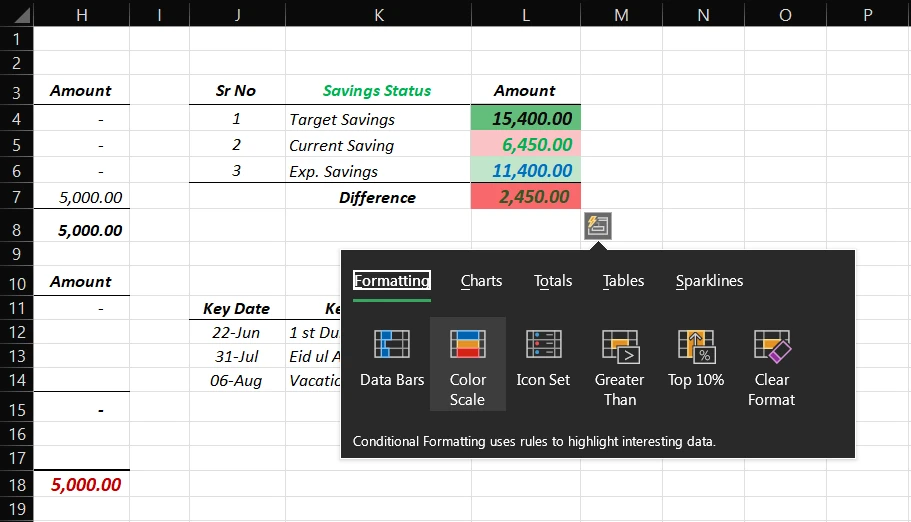
- Conditional Formatting: This allows users to highlight cells that meet certain criteria. For example, users could highlight all cells that contain values greater than a certain number or highlight all cells that fall within a specific date range.
- Data Bars: This displays data values as bars within cells, making it easy to quickly compare values. Users can customize the color and width of the bars to fit their needs.
- Font and Border Formatting: This allows users to change the font type, size, and color of their data. Users can also add borders around cells to help separate and organize their data.
Example: Let’s say a user has a dataset containing sales figures for each month of the year. They could use conditional formatting to highlight all cells that contain sales figures greater than $10,000. This would make it easy to identify which months had the highest sales and which months had lower sales.
Charts
Charts are a visual way to represent data and can help users to identify patterns and trends within their data. The Quick Analysis tool provides several chart options, including:
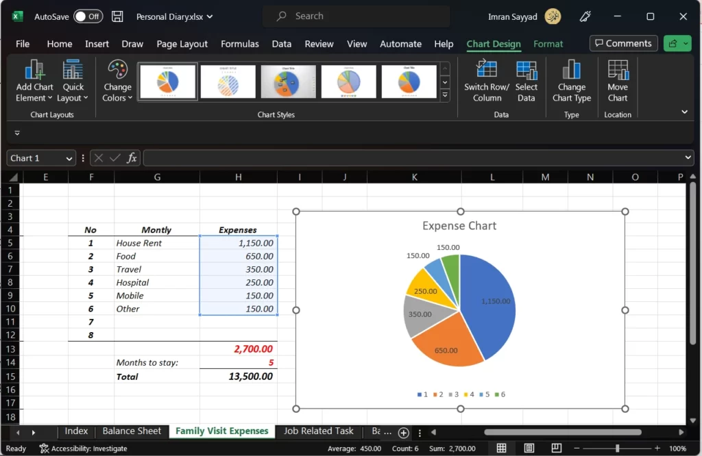
- Column Charts: This displays data as vertical bars, making it easy to compare values.
- Bar Charts: This displays data as horizontal bars, again making it easy to compare values.
- Line Charts: This displays data as a series of points connected by lines, making it easy to see trends over time.
- Pie Charts: This displays data as slices of a circle, showing the proportion of each value relative to the total.
- Scatter Charts: This displays data as a series of points on a graph, showing the relationship between two variables.
Example: Let’s say a user has a dataset containing the number of customers who purchased products from their online store each month. They could use a line chart to visualize the trend in customer purchases over time, making it easy to see whether customer purchases are increasing, decreasing, or remaining steady.
Tables
Tables are a useful way to organize and summarize data. The Quick Analysis tool provides users with the ability to quickly create tables from their data, along with several customization options:
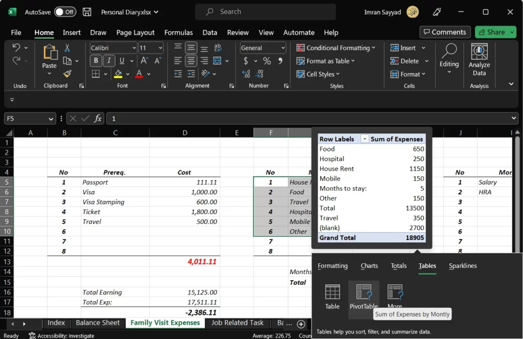
- Table Styles: This allows users to choose from several pre-defined table styles to make their tables more visually appealing.
- PivotTables: This is a powerful feature in Excel that allows users to summarize and analyze large amounts of data. The Quick Analysis tool provides users with the ability to quickly create PivotTables from their data and customize them to fit their needs.
- Filtering: This allows users to filter their data based on specific criteria, making it easy to isolate certain values.
- Sorting: This allows users to sort their data based on specific criteria, making it easy to identify the highest or lowest values.
Example: Let’s say a user has a dataset containing the number of units sold for each product in their store. They could use a table to summarize the data and then sort the table by the number of units sold to identify the most popular products.
Totals
Totals are a useful way to quickly summarize data. The Quick Analysis tool provides several options for calculating totals:
- Sum: This calculates the total of a selected range of cells.
- Average: This calculates the average of a selected range of cells.
- Maximum: This calculates the highest value within a selected range of cells.
- Minimum: This calculates the lowest value within a selected range of cells.
- Count: This counts the number of cells within a selected range of cells.
- % Total: This calculates the percentage of each value relative to the total.
- Running Total: This calculates the running total of the selected range of cells.
Example: Let’s say a user has a dataset containing the number of hours worked by each employee in a given month. They could use the total function to calculate the total number of hours worked by all employees in that month.
Sparklines
Sparklines are small charts that are designed to fit within a single cell. They are useful for quickly visualizing trends within a dataset. The Quick Analysis tool provides several options for creating sparklines:
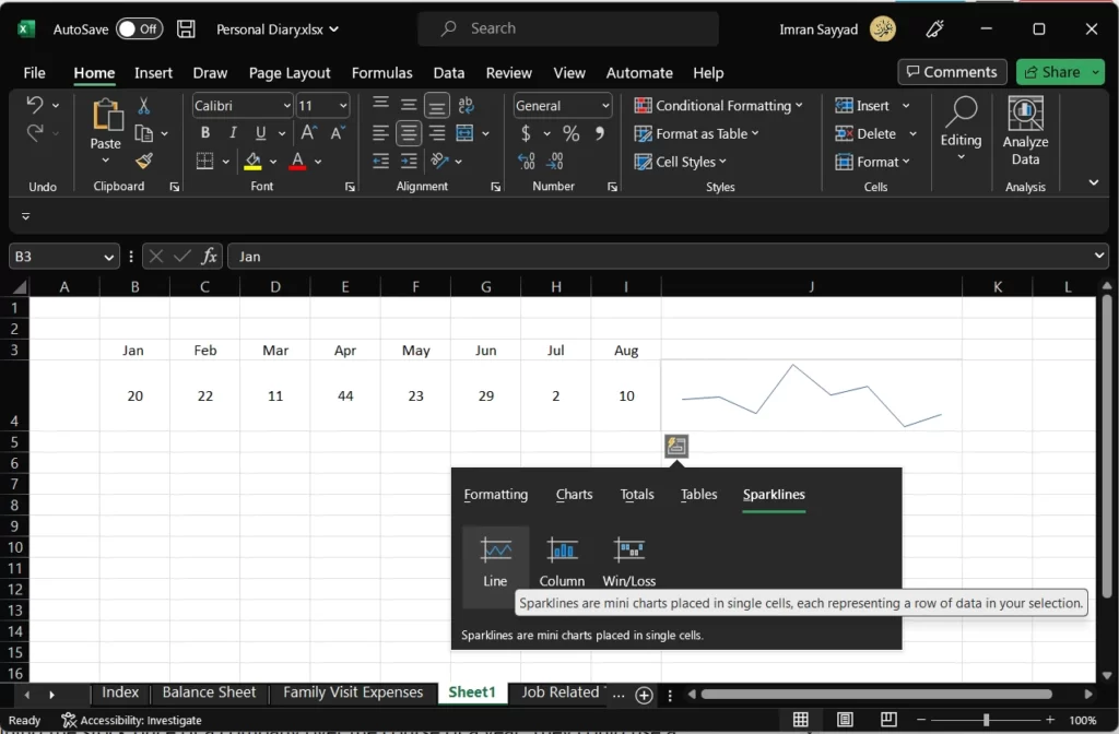
- Line Sparklines: This displays data as a series of points connected by lines, making it easy to see trends over time.
- Column Sparklines: This displays data as vertical bars within a cell, making it easy to compare values.
- Win/Loss Sparklines: This displays data as a series of arrows that indicate whether values are increasing or decreasing.
Example: Let’s say a user has a dataset containing the stock price of a company over the course of a year. They could use a line sparkline to create a small chart within a single cell that shows the trend in the stock price over time.
In conclusion,
The Quick Analysis tool in Excel provides a variety of options for analyzing and visualizing data. Whether you need to create charts, tables, or sparklines, or perform quick calculations, the Quick Analysis tool can help you to quickly and easily analyze your data. By using the different features available in the Quick Analysis tool, you can gain insights into your data and make informed decisions based on your findings.

